“But what do the data say?” Visualizing changes in Water Quality downstream of Exploratory Mining operations in Intag, Ecuador
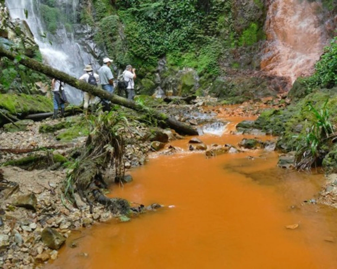
Figure 4: “The twins” waterfalls in 2018. The test point labeled “GEM” is at the base of the waterfall at camera right.
It’s funny how things have changed since last summer—instead of sitting on my friend Diego’s[1] porch enjoying spectacular views of the tropical Andes, I now seem to find myself mostly sitting behind a desk and staring at my laptop! During my Fellowship year I have been working with Diego and the other campesino-activist leaders of his community’s environmental monitoring group to co-author a scientific study of the relationship between exploratory mining operations and local water quality in Junín, their corner of Intag, Ecuador. Specifically, we aim to use GIS technology to model the relationships between water quality at specific test stations and those stations’ proximity to upstream exploratory boreholes. For me, this has lately meant less time spent following Diego and others as we cut our way through the cloud forest in search of data from remote streams (although there is still some of that), and more spent visualizing that data on a computer screen—a tradeoff that I sometimes regret, but at least I am out of the rain!
The first step in this process was to build a geodatabase in ArcGIS Pro that would allow for this kind of spatial analysis—a process that itself involved many hours of data modeling, acquisition, digitization, transformation, and editing. Then, once I had my database set up and complete with all its vector feature classes, rasters, and topology rules, I was ready to begin populating the geodatabase with our water quality data—a process that, I soon found, involved many more hours of rote transcription! With the geodatabase complete and populated with data on heavy metals concentrations, however, I have finally found myself in a position to visualize some of these data. So far, the results are mostly as we expected.
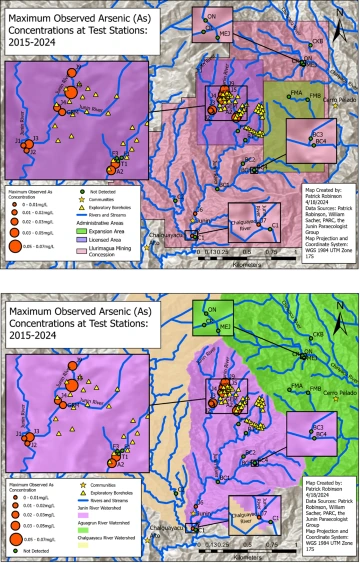
Figures 1 and 2: Maps illustrating the maximum arsenic concentration observed at each test station in the study area. These maps clearly suggest an association between exploratory drilling and elevated arsenic concentrations.
Consider, for example, the two maps presented above. Figure 1 clearly shows that the highest recorded arsenic concentrations—as well as all of the documented arsenic concentrations in excess of the World Health Organization (WHO) drinking water safety standard of 0.01mg/L—were recorded in the “licensed area” of the Llurimagua mining concession (that is, where exploratory drilling has so far taken place). For its part, Figure 2 shows that these same concentrations were all recorded within the Junín River watershed; notably, the map highlights the fact that we have never recorded detectable concentrations of arsenic in either of the adjacent watersheds. A visual review of these maps clearly suggests an association between elevated arsenic concentrations and exploratory drilling—an association which local people have long suspected, but which they formerly lacked the technical means of communicating to others.
Arsenic exposure is well known to cause skin lesions, hyperkeratosis, skin cancer, and liver disease, among other health problems in humans, and indeed some local children have presented with skin lesions after bathing in the Junín River; that’s why I’ve chosen to visualize arsenic concentrations here. Importantly, however, the general pattern holds for several other heavy metals as well, as Figure 3 shows.
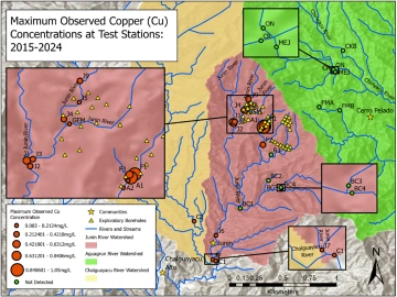
Figure 3: A map showing the maximum copper concentration observed at each test station in the study area. Once again, the highest concentrations were observed near exploratory boreholes.
Importantly, in addition to comprehensive overviews of the data collected in the study area like those included above, the geodatabase has allowed me to produce maps illustrating changes in the values of metals concentrations at specific locations—including in near “the twins” waterfalls, one of which changed color markedly after the onset of exploratory drilling (see Figure 4).
Figure 4: “The twins” waterfalls in 2018. The test point labeled “GEM” is at the base of the waterfall at camera right.
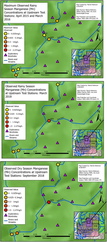
Figures 5, 6 and 7: Point-in-time maps that together illustrate successive increases in manganese concentrations at GEM and J3 during the most recent period of exploratory drilling (2015-2018).
Together, Figures 5 and 6 illustrate the dramatic increases in manganese concentrations recorded over successive rainy seasons at the righthand “twin” (GEM) and station J3 downstream from 2015 to 2018—that is, during the most recent period of exploratory drilling, when all of the boreholes pictured were drilled.[2] Notably, while manganese concentrations at station J1 and upstream of the other “twin” did not change significantly over this period, the values recorded at J3 increased by 660% and those at GEM by 4,426.5%.
The increase is even more marked if we compare the initial rainy season values with dry season values from 2018 (Figure 7). In that case, the increases are of 2,393.33% and 7,524.12%, with the concentrations topping out at 0.374mg/L and 2.19 mg/L—well over the Ecuadorian government standard of 0.1mg/L for the preservation of aquatic wildlife, and approaching or exceeding the WHO drinking water safety standard of 0.4 mg/L. And manganese concentrations are not the only ones that saw substantial increases at these test stations during this period; iron and zinc concentrations also increased markedly, in some cases exceeding government standards.
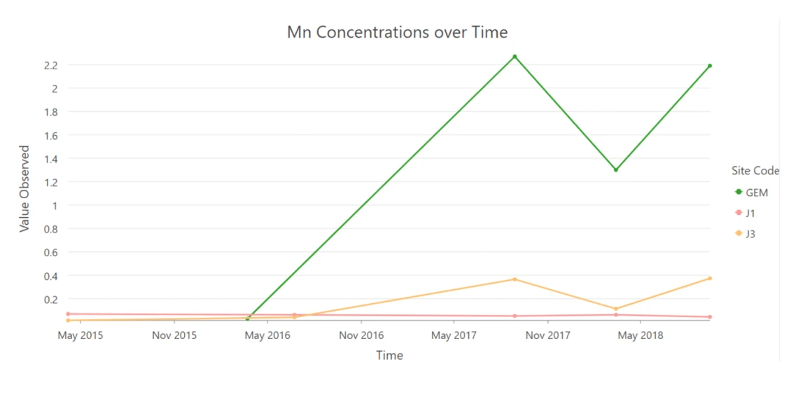
Figure 8: A line chart illustrating the changes in manganese concentrations from 2015-2018 at J1, J3, and GEM. Concentrations recorded at J1 hardly changed during this period, while those recorded at GEM and J3 increased markedly, often approaching or exceeding WHO and Ecuadorian government standards.
“These maps are very helpful,” Diego said when I sent them his way. “With these, we can see how the quality of our water is changing. What’s more, we can see whether these changes are the result of natural, seasonal patterns or the impacts of mining activity—or even agriculture and livestock-raising.” I agree with Diego’s assessment. Yet, the truth is that my community partners and I are just getting started in our quest to establish whether there is a causal relationship between exploratory mining operations and the water quality degradation observed by local people in the Junín River watershed. In fact, the low resolution of metals concentrations data makes it impossible to draw conclusions from these data alone (due to financial limitations, we are only able to collect one or two samples from each site per year for laboratory analyses). To do so, we need to supplement these data with the much higher resolution (bimonthly) pH, electrical conductivity, temperature, and dissolved solids data we have long been collected in-situ. So, the next step for me is to integrate these data into the GIS—a task which, given the many thousands of data points at hand, is likely to take some time. Once I do so, however, we will be in a much stronger position to use multivariate linear regression modeling, statistical interpolation, and other techniques to model the relationship between water quality and test station path distance to upstream boreholes. So, while we are still a long way off from our plans to publish our study, I am satisfied that we are making good progress. The work goes on, as always. So don’t be surprised when, one day soon, you see my name on the byline of our long-awaited article—right beside Diego’s.
[1] All names appearing in this text have been changed to protect the identities of research participants.
[2] Because of the variance in the dilution effect resulting from the substantial natural variation in seasonal rainfall that characterizes this area, it is widely considered best practice to compare data collected in the rainy season with other rainy season data, and dry season data with other dry season data.